
Brand Naming
C-Suite Leadership
Managed IT Services
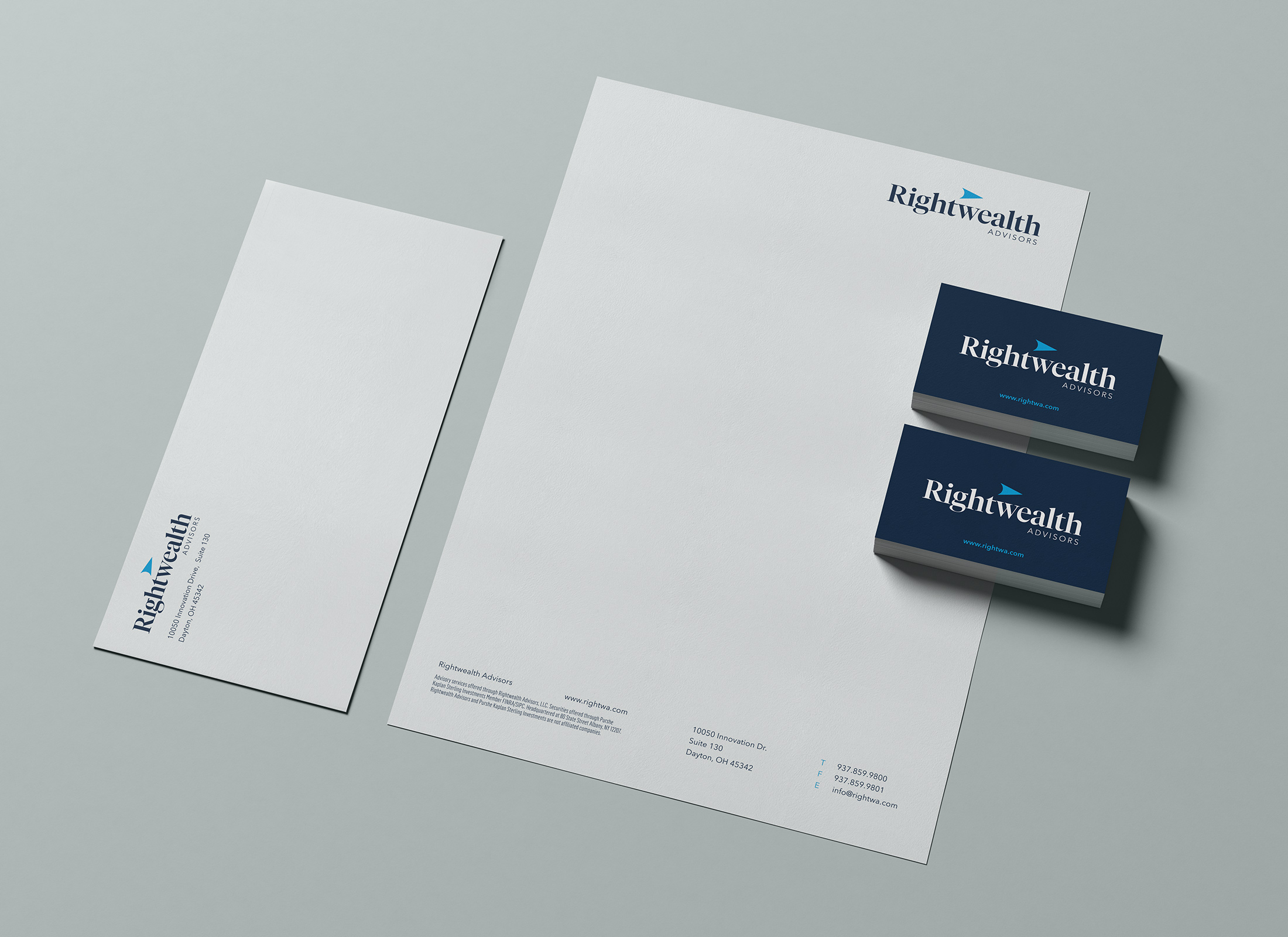
Print Materials
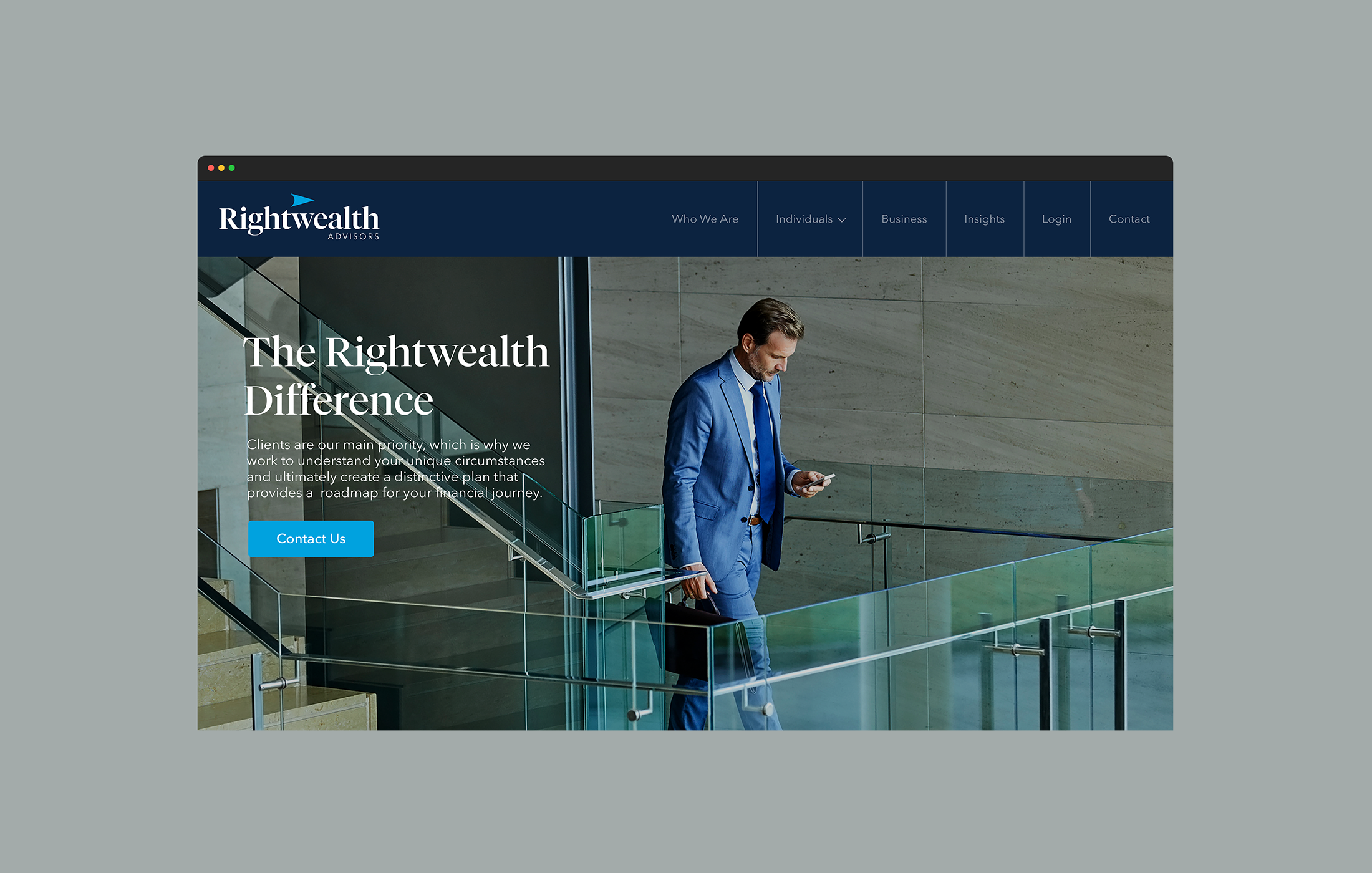
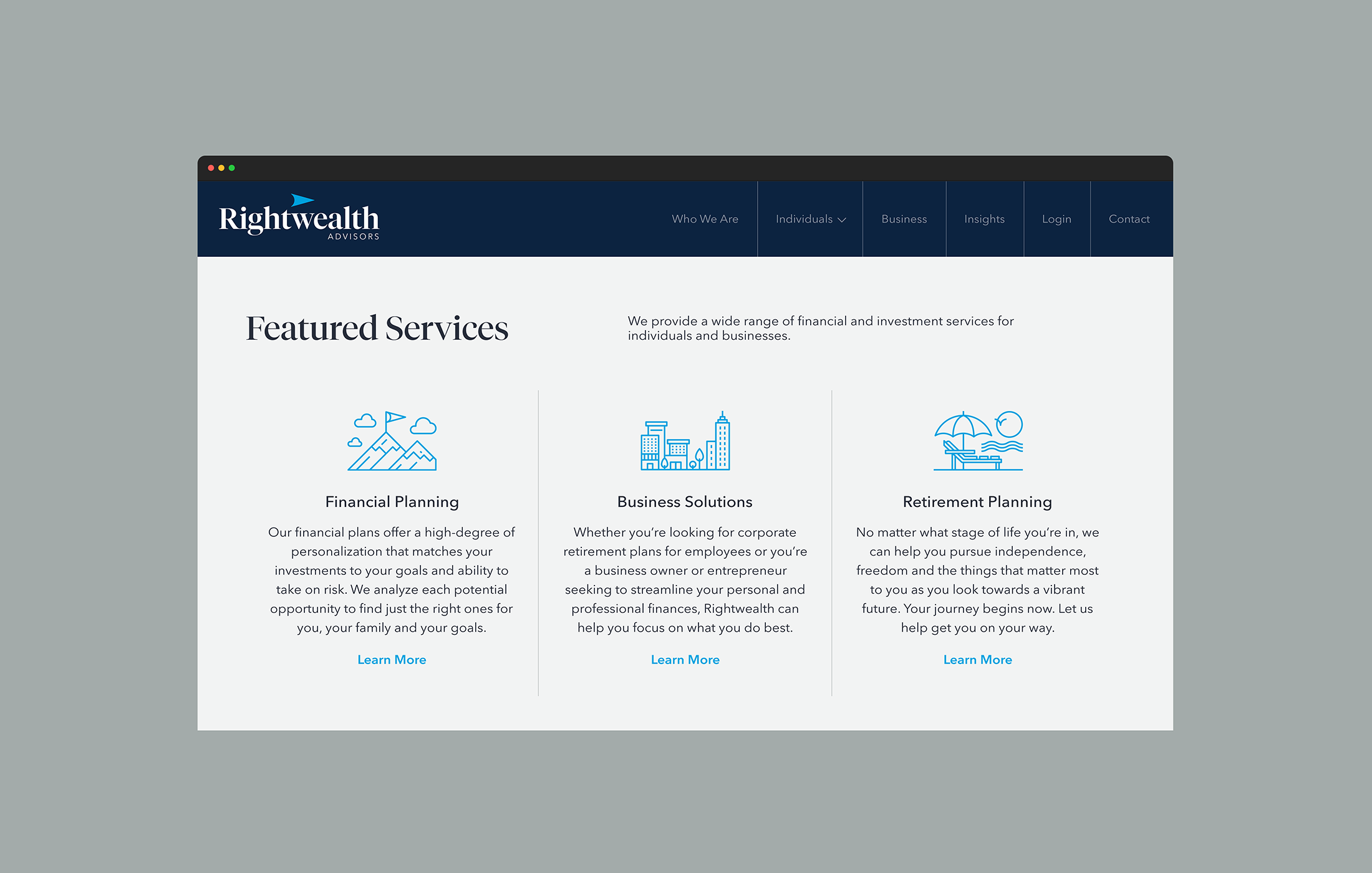
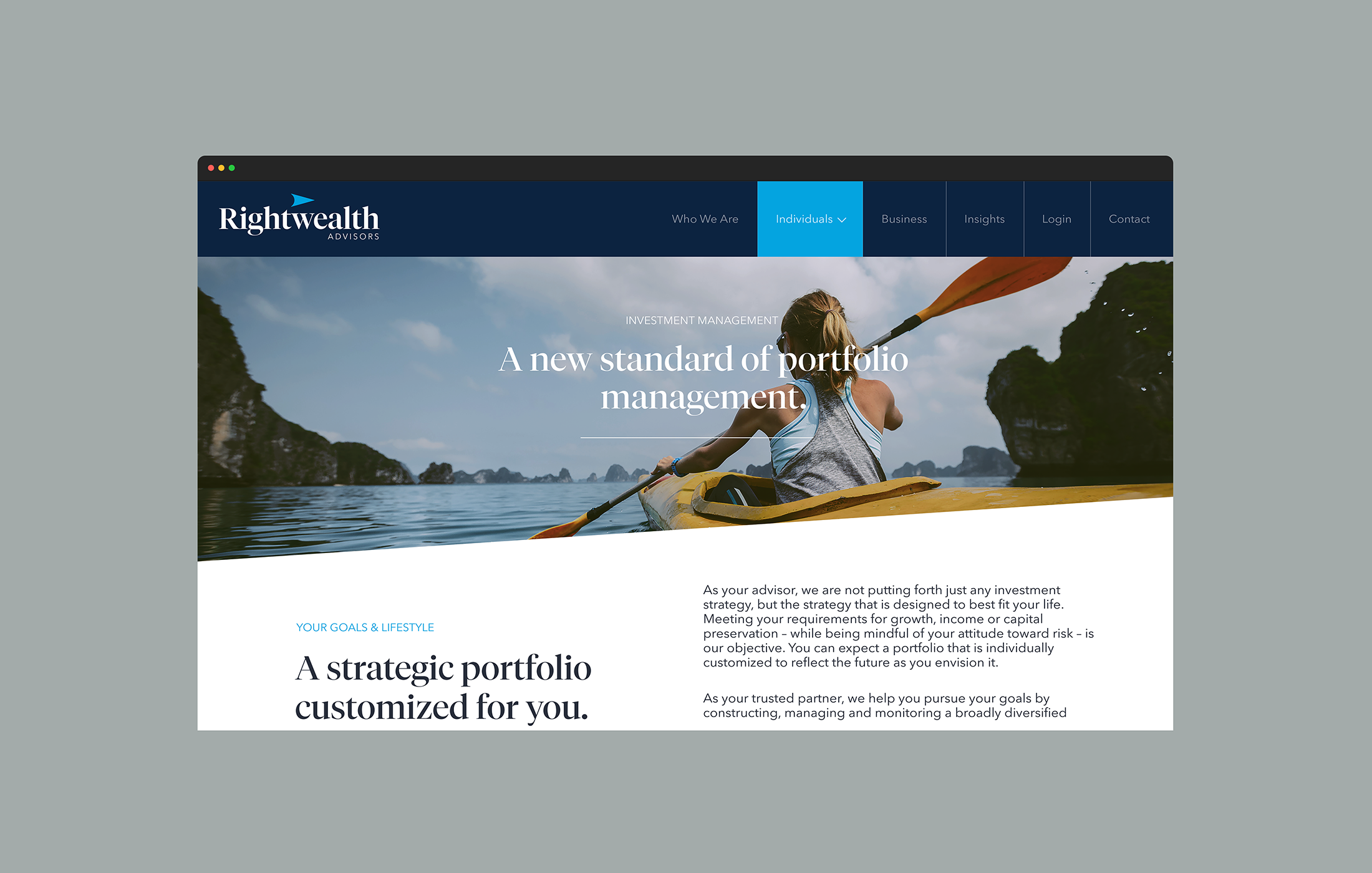
Web & Mobile Design
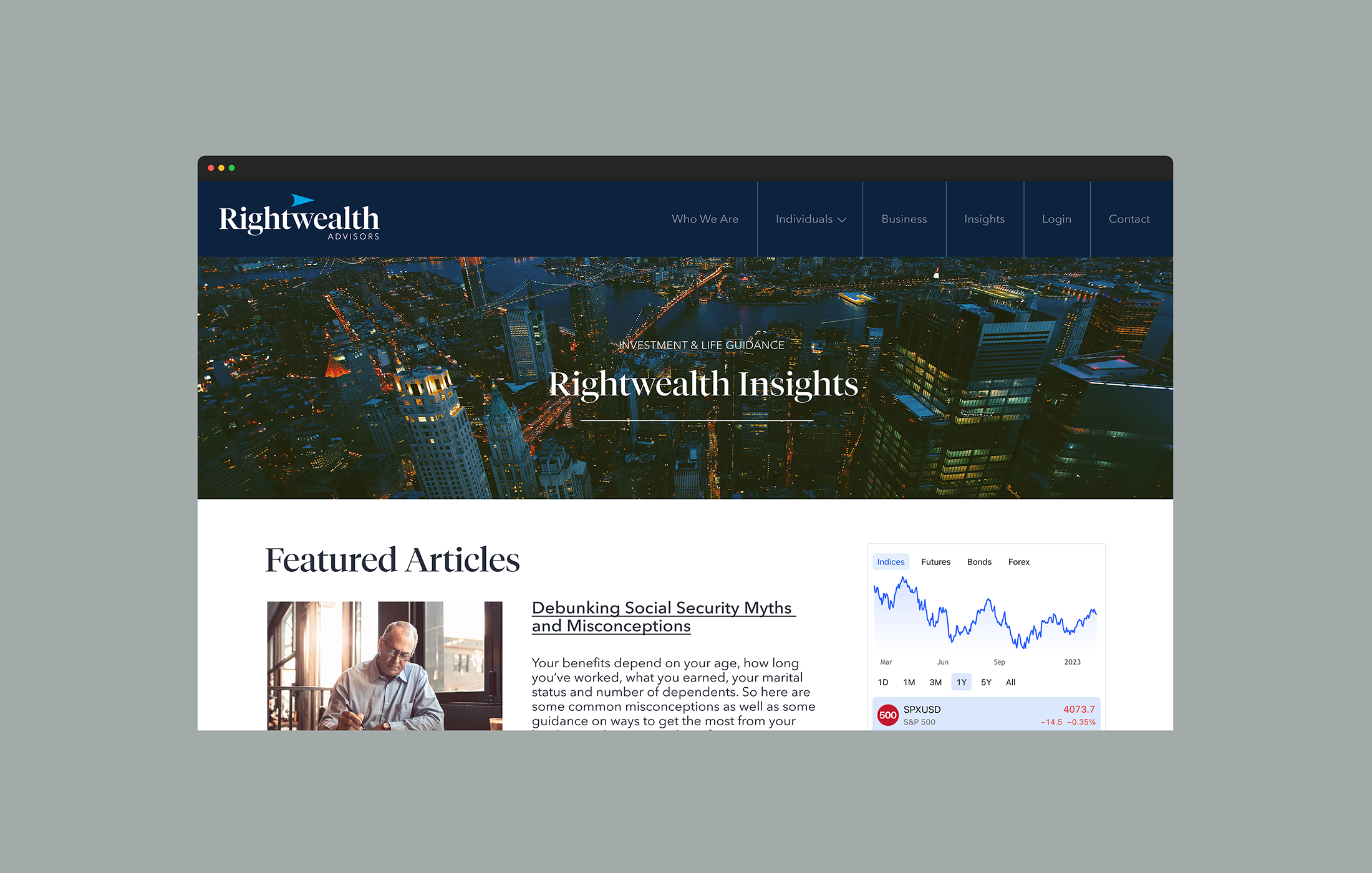
A local Dayton Registered Investment Advisor (“RIA”) group was in need of a new name and a comprehensive brand and technology makeover. The new brand would establish both market and technology independence as they separated from their custodian and began expanding on their team and already established success.
After a thorough research and discovery of potential names in collaboration with the wealth management team, it was unanimously decided that Rightwealth Advisors was the perfect choice for the rebrand. As an added bonus, the financial firm is conveniently located near the hometown of the famous Wright Brothers.
Chief Technology Officer Services: Dedicated representation and responsibilities akin to an in-house CTO. This includes strategic planning, overseeing technological infrastructure, and driving tech-related decision-making.
Cybersecurity Management and Consultation: Outsourced Cybersecurity Officer, encompassing a wide range of services such as cybersecurity education, continuous security monitoring, and conducting regulatory compliance testing.
Website Hosting and Analytics: A full suite of website hosting services which include proactive monitoring, management, and updates. Analytics for all digital platforms with detailed tracking of user engagement, traffic patterns, and effectiveness of content.
Managed Services for IT Operations: Comprehensive managed services leveraging Microsoft Azure and Acronis. This includes cloud infrastructure, data backup, and recovery solutions. Remote monitoring and management to ensure seamless and efficient operation, reducing downtime and enhancing productivity.
1.3
Grounded with a modern serif that strikes a balance between bold and light, warm curves and sharp details — the Rightwealth logotype presents a strong, but approachable statement.
There were several elements at play with the final logomark. Direction from the name, the compass metaphor often associated with financial advisors, and the geographical relevance to being in the Wright Brothers backyard were all taken into consideration. In the end, a simple arrow shape with angles complimenting the angles in the letterforms encompassed all three ideas to finish off the design.
The overall brand would be dominated by mainly two colors of blue, but supported by a handful of secondary colors to compliment when applicable.
