New brand identity, website, and packaging for the world’s first and only fully-synthetic, antimicrobial, and bioresorbable wound matrix.
Summary
1.1
Brand Identity
Event Display
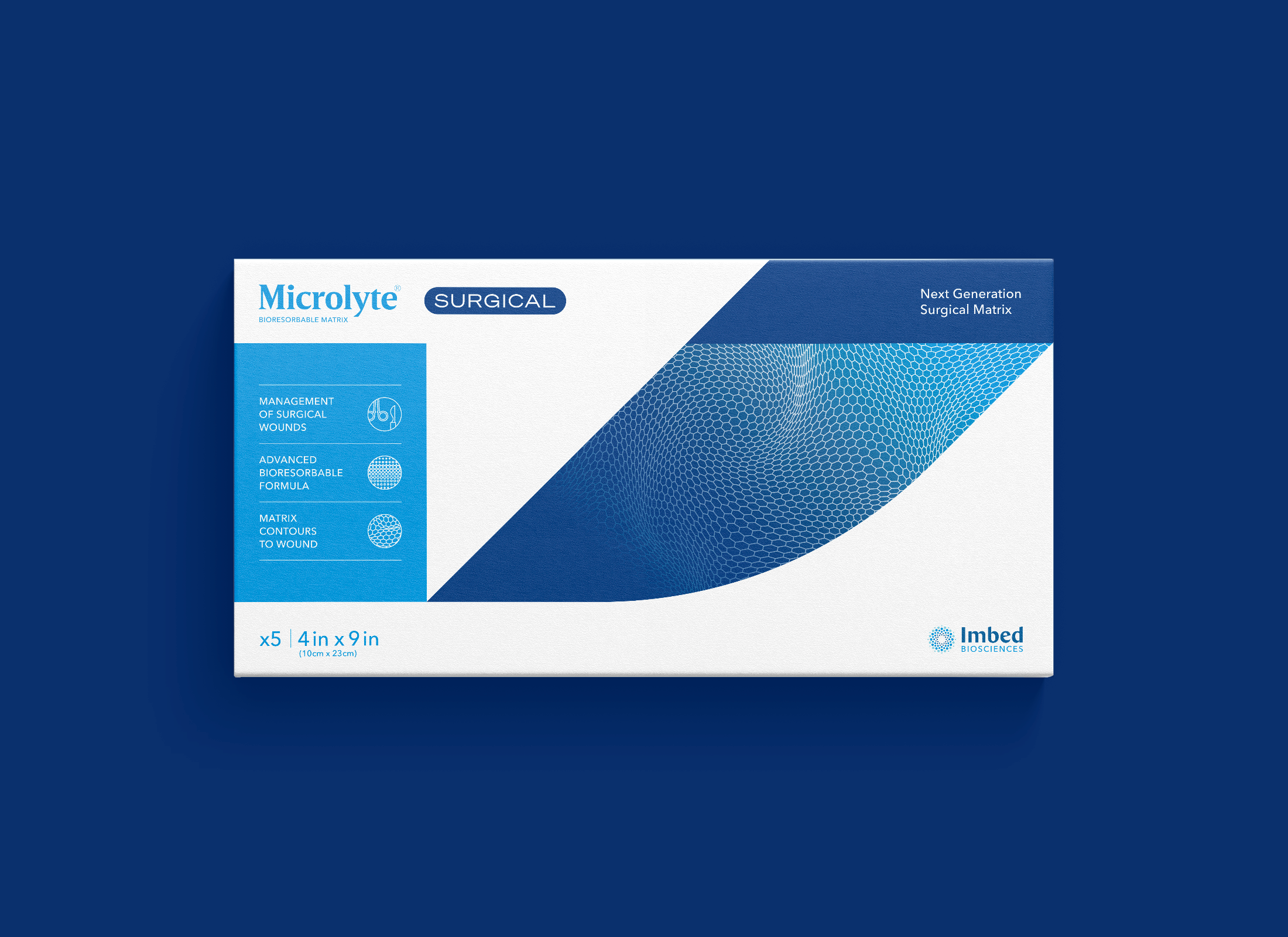
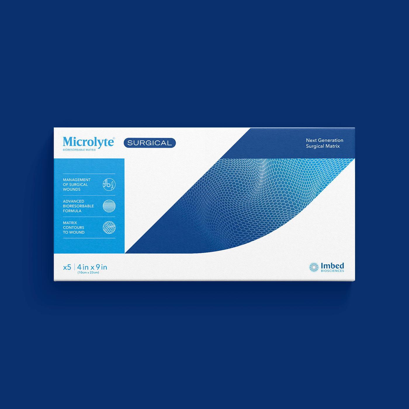
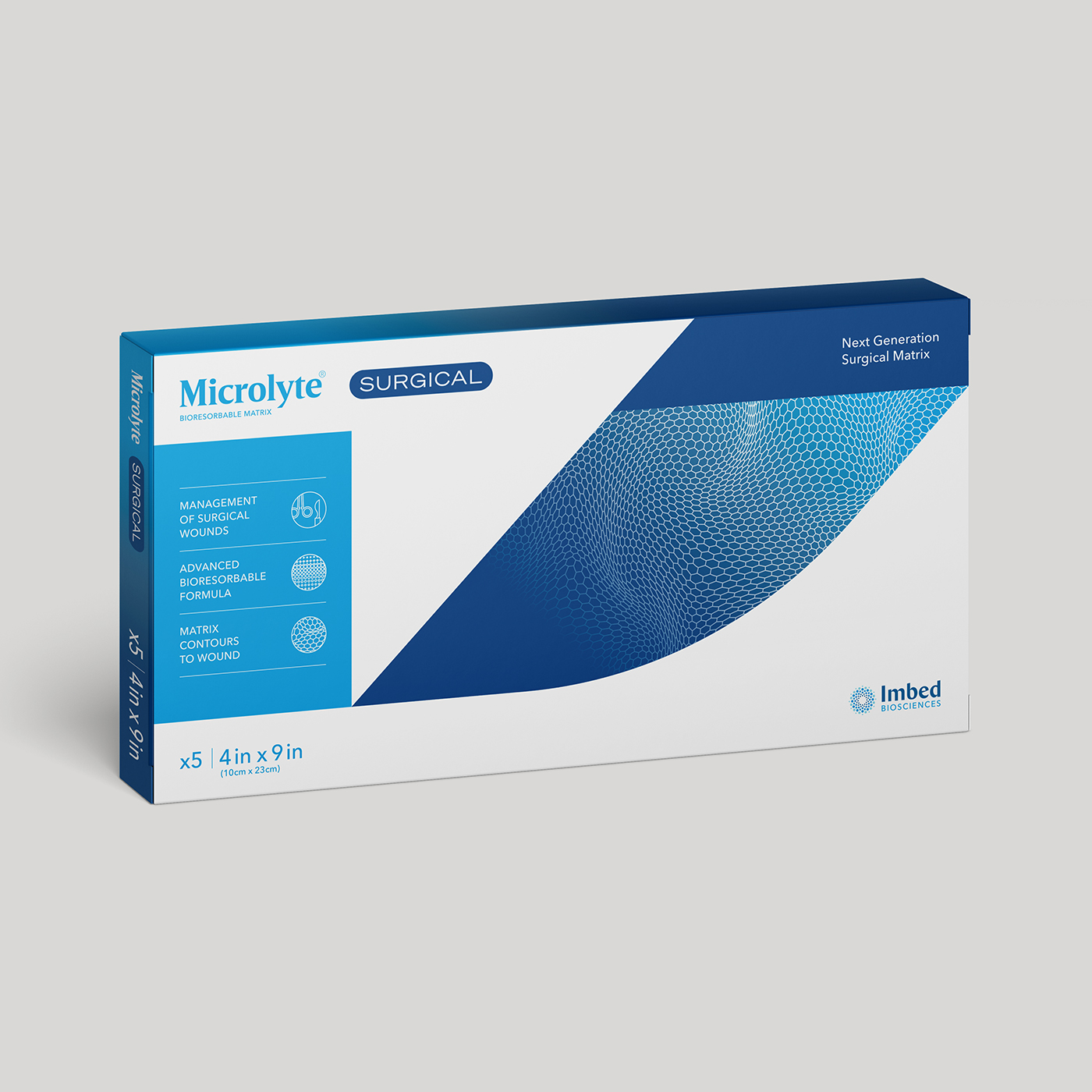
Packaging
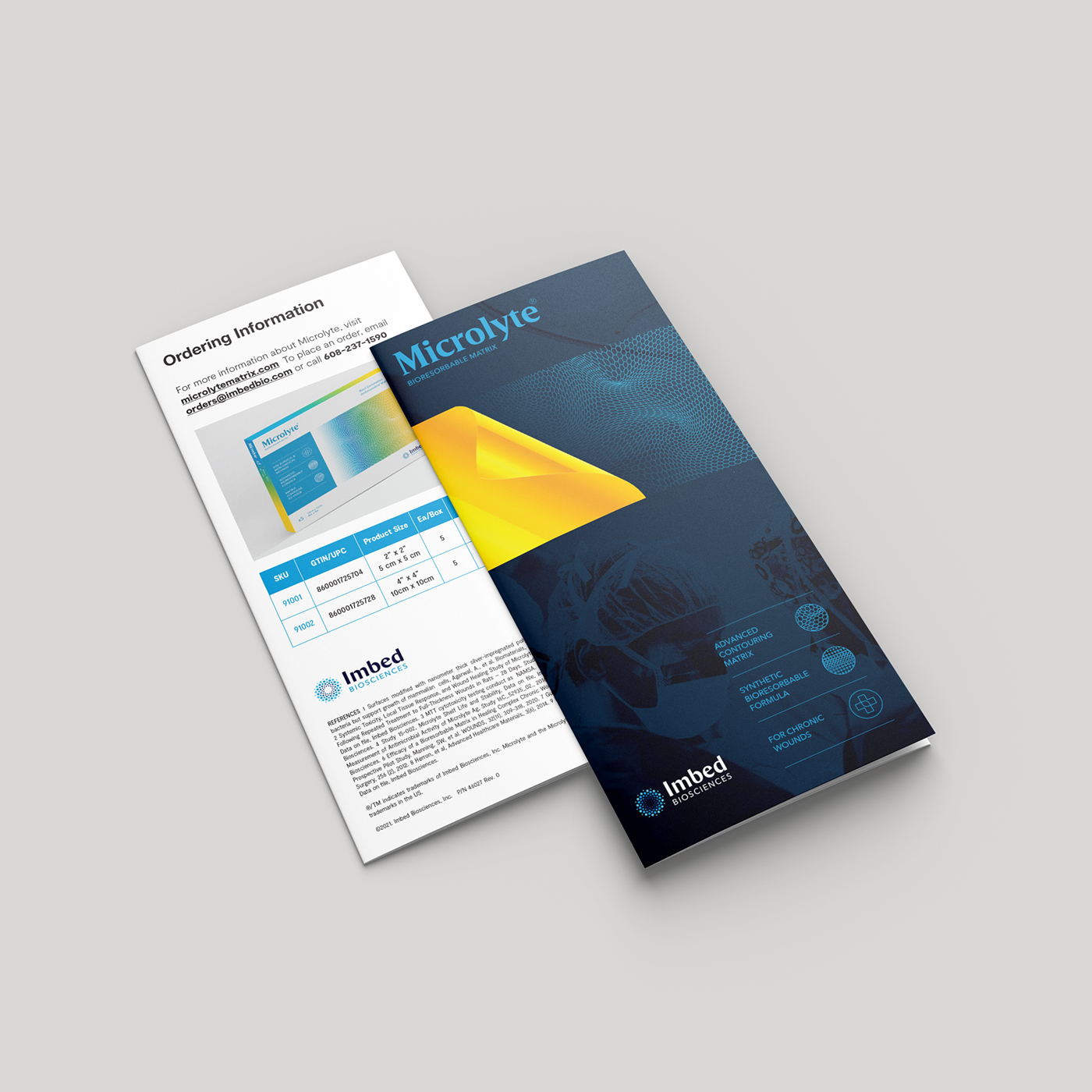
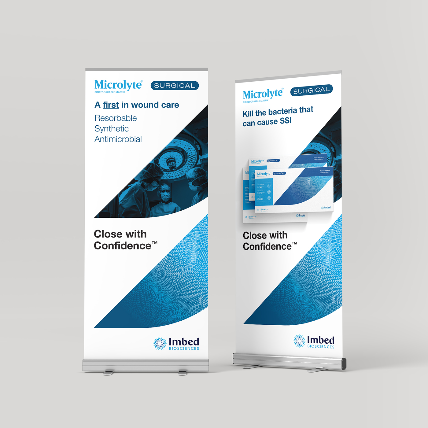
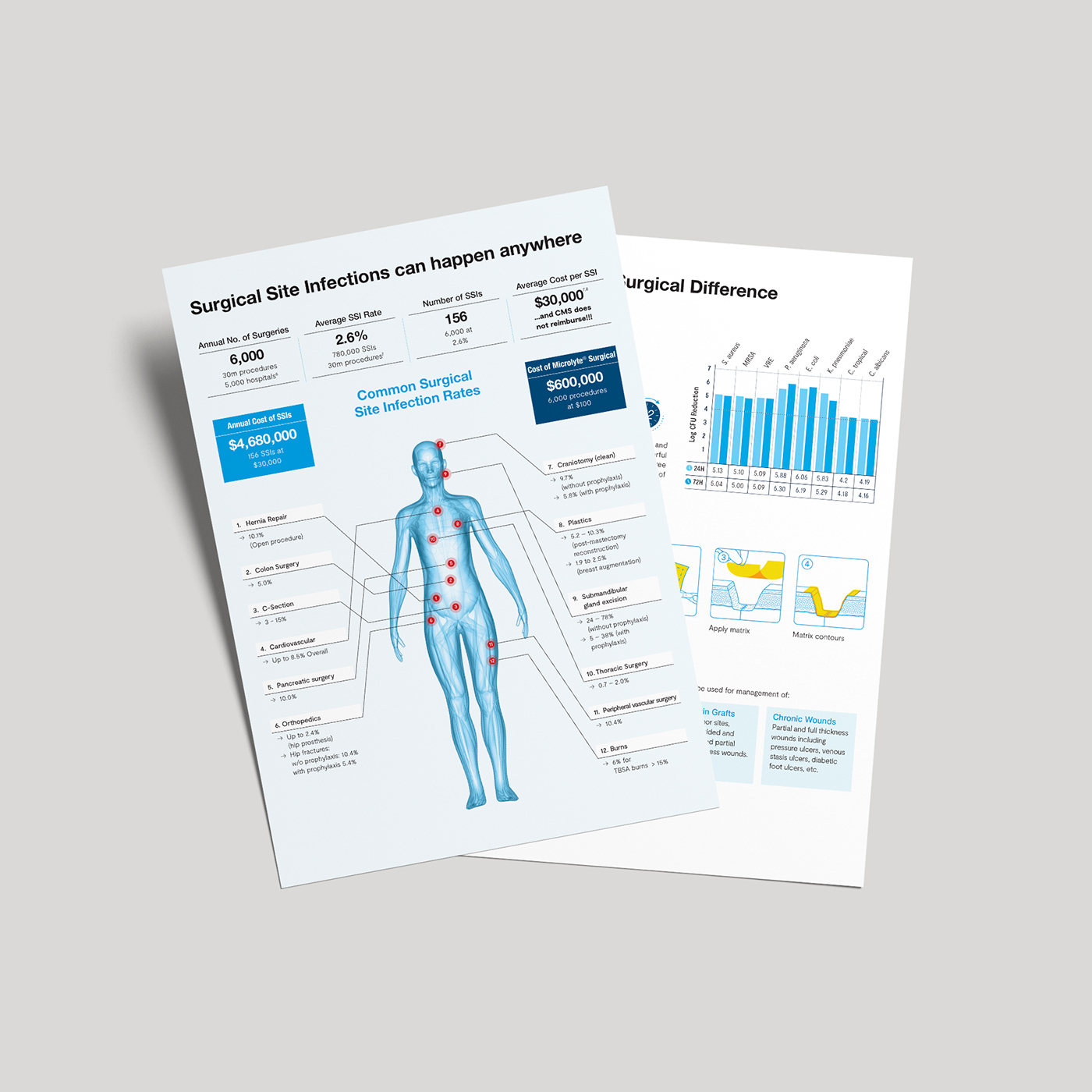
Print Materials
Social Media
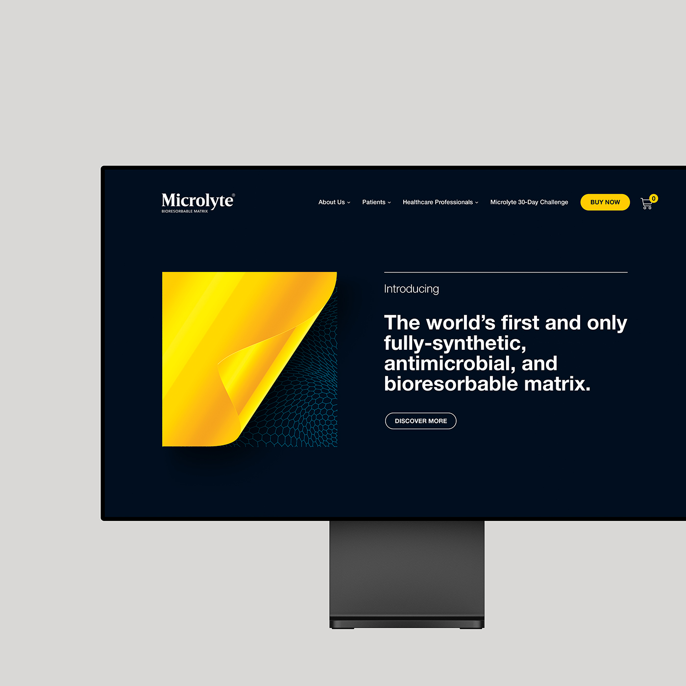
Web & Mobile Design
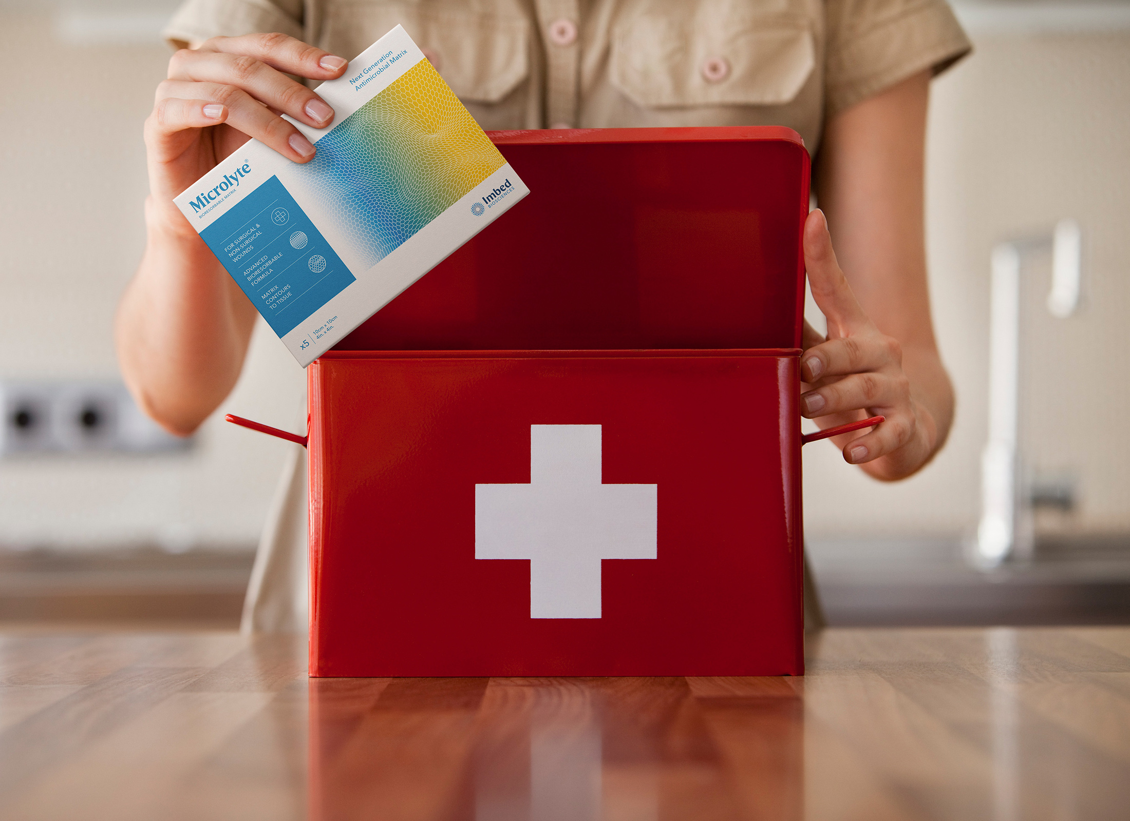
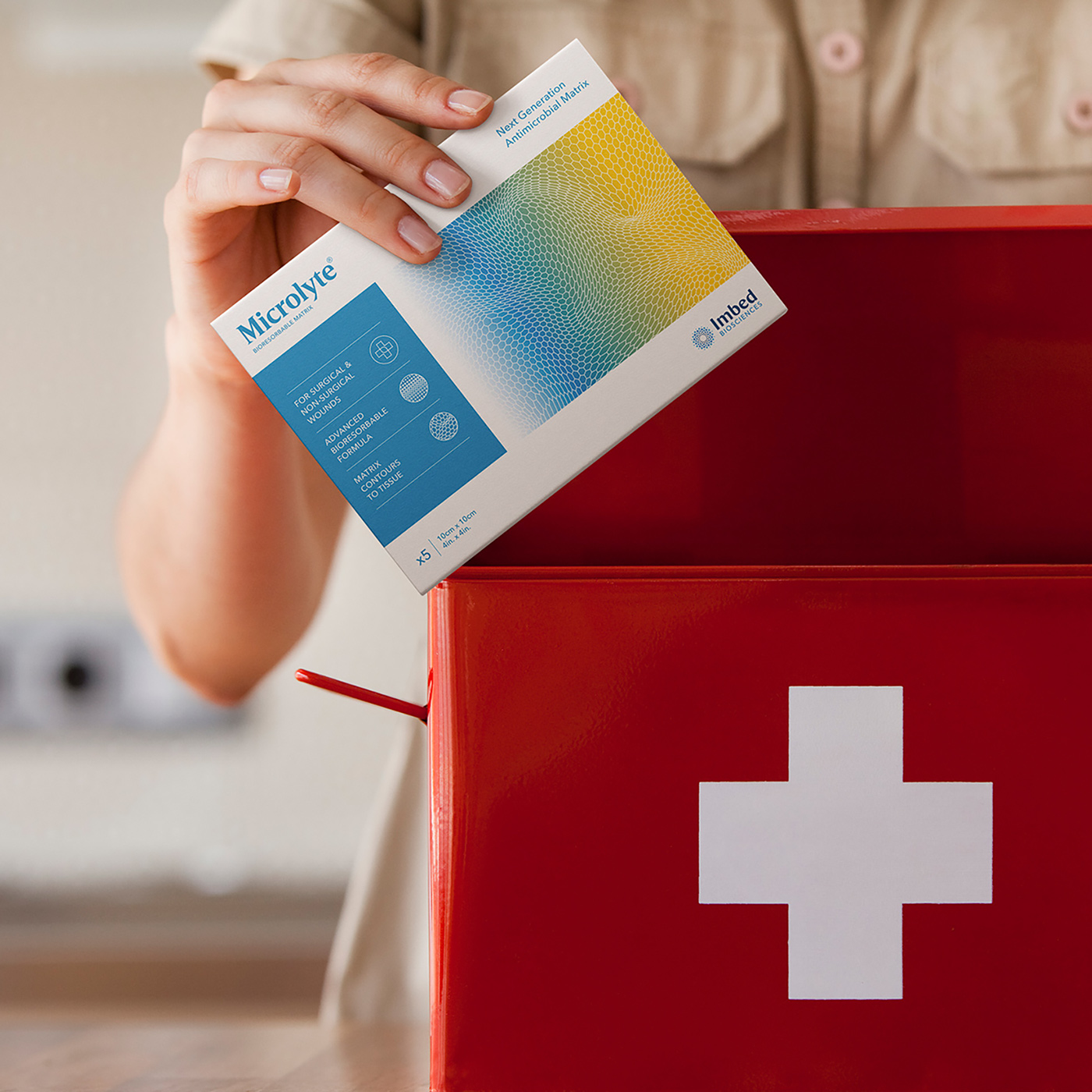
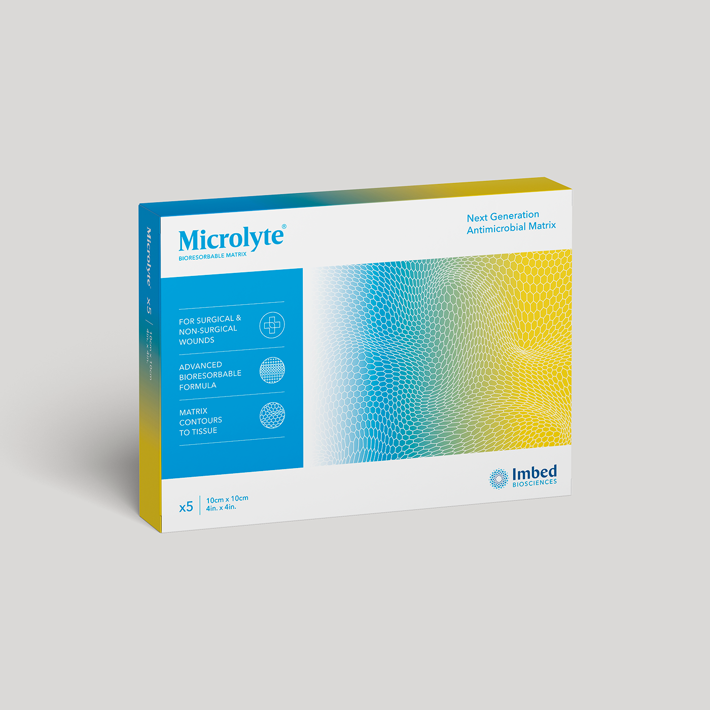
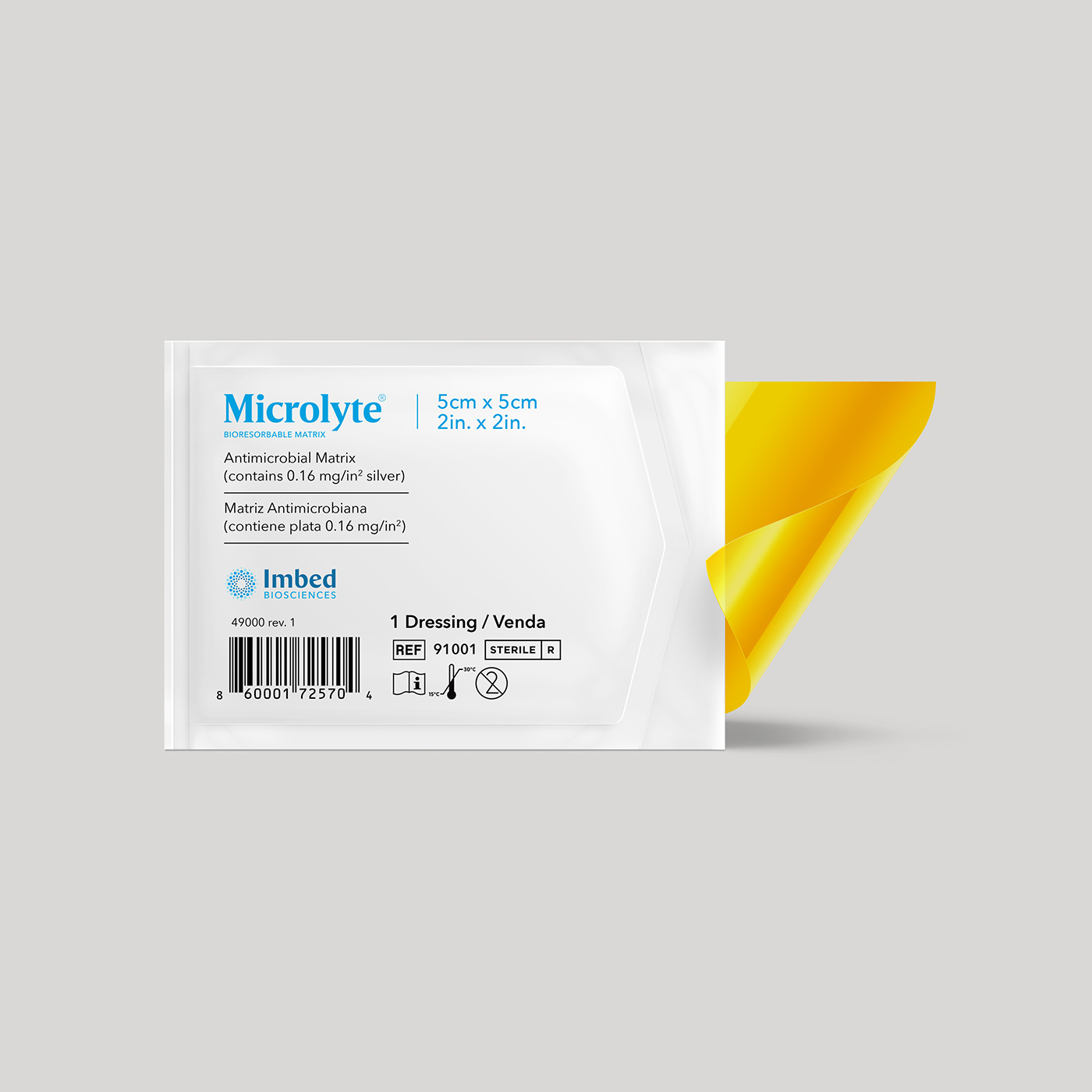
Imbed Biosciences is a medical device company emerging as a leader in the development of advanced therapies for soft tissue repair. Their cutting edge technologies and solutions with bioresorbable matrix applications have set a new standard in the management of chronic ulcers, burns, and surgical wounds. While traditional wound dressings require frequent and often painful replenishment through the healing process, Microlyte’s innovative bioresorbable construction naturally dissolves into the skin over time while providing an antimicrobial barrier that helps prevent further damaging infections. Altabos partnered with Imbed Biosciences to rebrand and repackage their flagship product Microlyte, along with it updates to both Imbed Biosciences and Microlyte’s websites, new marketing materials, and signage for conferences.
Brand Identity
1.2
Before
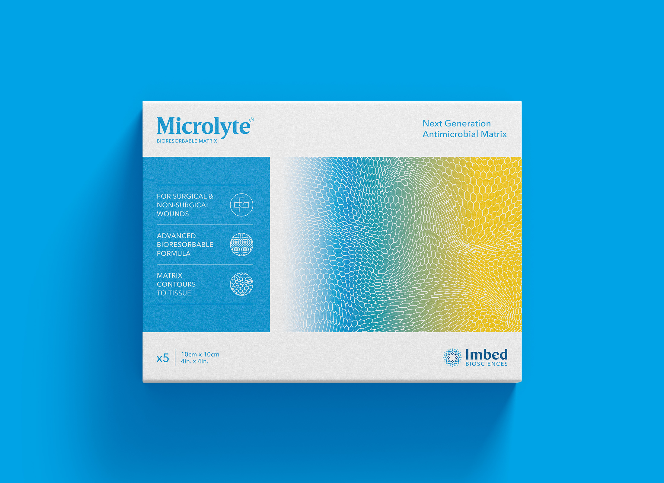
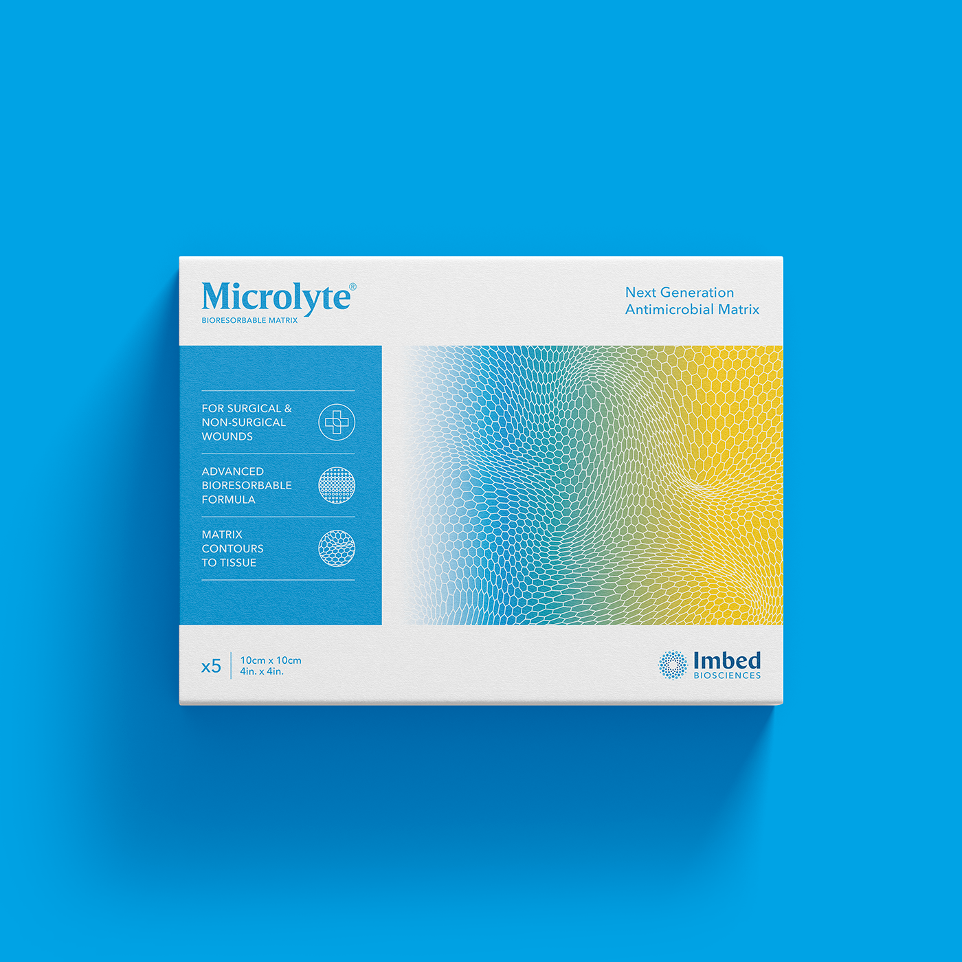
A classic case of an over-designed logo. The previous Microlyte brand was too complicated and didn’t seem to match the power and strength of the actual product. By reducing the logo to one color, eliminating the unnecessary capitalized “L” and “AG” (the symbol for silver), and changing “Antimicrobial Wound Matrix” to Bioresorbable Matrix (the more critical differentiating feature), we were able to simplify the brand’s identity making it easier for consumers to remember and adopt.
It was critical to change the typefaces used in the Microlyte brand in order to achieve a stronger and longer-lasting impression. While the brand name itself already suggested feather-light characteristics, the product itself is extremely powerful and advanced. This presented us an opportunity to set the logotype in a bold, modern and uniform serif typeface to maximize legibility and deliver confident assurance.
Establishing a strong yet simple color was a crucial element for maintaining a consistent visual brand. Drawing on the product’s natural color (yellow) and a color that reflected purity and cleanliness (blue), we were able to convey characteristics of healing and optimism.
Utilizing gradients of the brand’s colors provided visual reference to the product’s transformative process while the matrix pattern helped convey its unique multilayered nanofilm technology.
With future product extensions planned, a system of iconography was developed to quickly communicate the product’s key characteristics and differenetiators.
Brand In Use
1.3
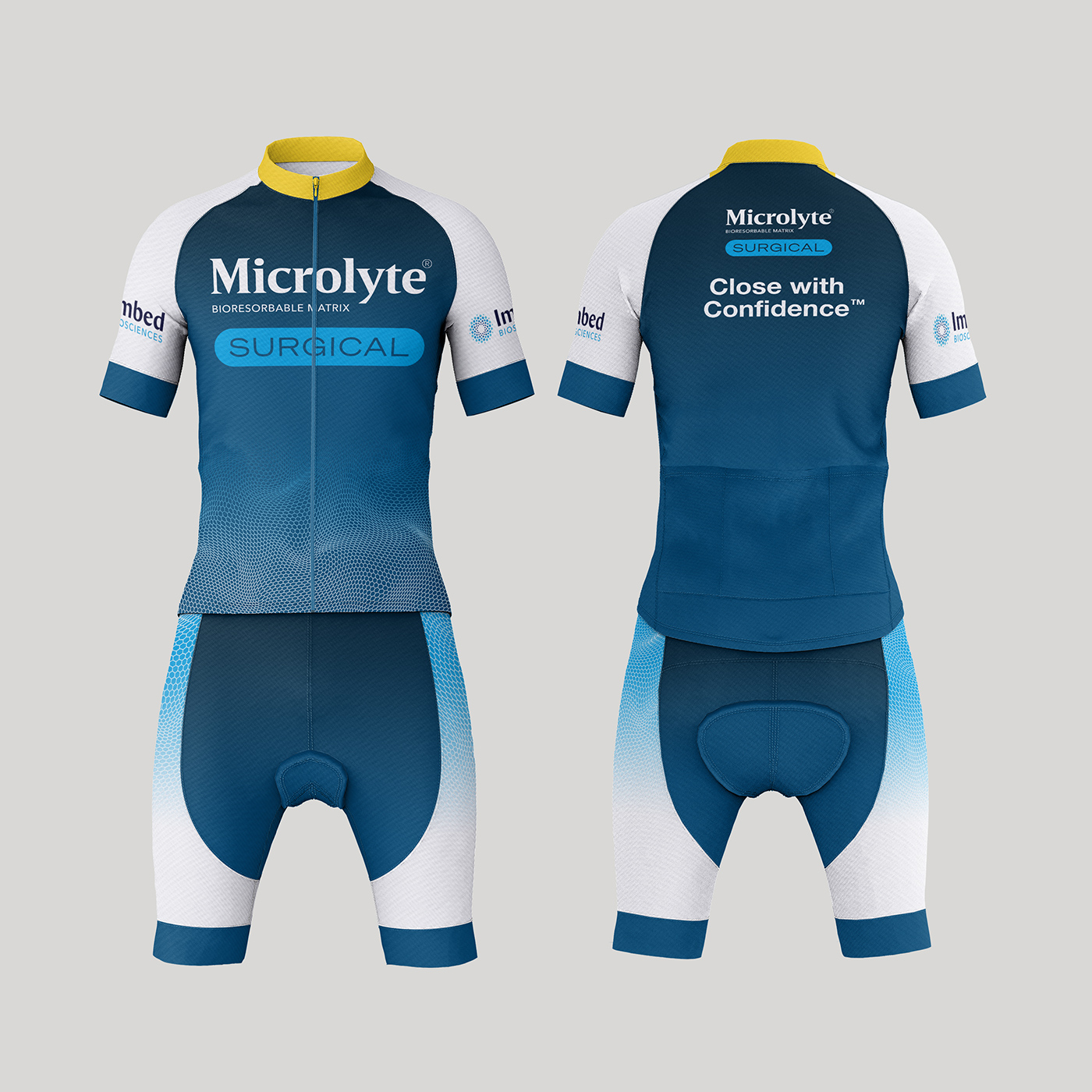
The success of this ground-breaking technology in wound treatment led to Microlyte expanding its product line to accomodate a tailored line specifically for surgeons.
To firmly distinguish itself from the original brand, the eye-catching yellow was replaced in favor of a sophisticated deeper blue. In addition, a silhouette in the likeness of a surgical knife was established for a acutely dramatic appeal.